


There’s something new in the air at OUM and it’s more than just a refresh. It’s a movement, a bold step forward into a future shaped by a new generation of learners and a rapidly evolving digital world.
Take a moment to look around. Our learners today are younger, more agile and more independent. They are digital natives, comfortable navigating technology, making their own choices and shaping their own paths. They don’t just want education. They want flexibility, control and freedom.
OUM was founded on a powerful mission to democratise education and make learning accessible to all. That purpose remains unchanged. However, the market landscape has evolved. While we already have the technology to support learners’ expectations, our brand needs to evolve to reflect this new reality.
We are ready to introduce a refreshed identity that is modern, vibrant and aligned with our strategic direction. At the core of this refreshed identity is a refined colour system. Our new primary colours rooted in the family of blue and teal, symbolise trust and growth. It integrates seamlessly with our digital platforms. To bring more vibrancy and flexibility, we are also introducing five secondary colours that add energy across all our communication and commercial assets.
One of the most exciting elements of this transformation is the introduction of five supergraphics – distinctive design patterns that help bring our identity to life. They are creative tools that allow designers to express ideas while maintaining a strong and recognisable OUM identity.
- The Wings of Possibilities, representing freedom;
- The Expansion, symbolising opportunity;
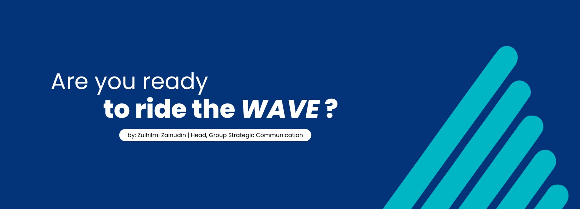
- The Wave of Change, capturing transformation;
- The Turning Point, reflecting progress; and
- The Stepping Up, embodying achievement.
While the transformation is significant, some elements remain familiar. Our logo, for instance, has undergone only about a 30% refinement. Yet, this subtle update creates a noticeable difference in its overall look and feel. It is now cleaner, fresher and more modern, making it highly adaptable to our current marketing and brand strategies while capturing the attention of a younger audience.
Typography also plays an important role in this refreshed identity system. We are moving from Avant Garde to a more minimalist font that is rounded, simple, clean and friendly, qualities that suit modern design and digital readability. To complement this, a secondary font has been introduced, adding flexibility while maintaining consistency across all brand expressions.
This transformation is not just about design, it is about how we present ourselves, how we communicate and how we evolve together as one OUM. It reflects our readiness to embrace change and to stay relevant in a fast-moving world. We believe this refreshed identity will spark excitement not only among designers, but across the entire OUM community.
The wave of change is here, bringing with it new energy, new ideas and new opportunities. It challenges us to think differently, act boldly and embrace the future with confidence.
This is more than a new look – it is a new momentum.
Are you ready to ride the wave?